The Biggest Problems with MacOS Tahoe’s Music.app
A lot has been written about MacOS 16‘s (Tahoe) strengths and features, but little about how it actually is to navigate around the various included apps. The one most people will be familiar with is Music.app, that prior to the rename was called iTunes. This app is a masterclass in arbitrary placement of controls.
The first problem is the interface has changed drastically from MacOS 15 (Sequoia). This normally wouldn’t be much of an issue, but these changes defy logic, and it wastes even more screen real estate than previous versions and much more space than iTunes. Real estate on laptops is precious, and considering the install base of laptops, there are many people in my boat of needing a lot of space saving UI elements.
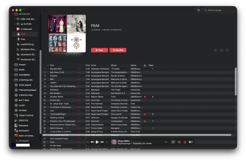
For the past many versions playlist metadata takes up a third of the screen on a laptop showing a mini-collage of 4 album covers and the name of the playlist in huge letters, and under it a description of the playlist you wrote. It also gives you the number of tracks and the playlists entire duration. This extra info was doubled because it was also shown on the bottom of the main window. That status bar is missing despite choosing it as visible in the View menu. It also has a very thick padding of “dead air” around the entire (we’ll call it a) playlist info pane. This extra space takes up 6 lines of songs (looked at it from “View…As Songs” setting.) Now with Tahoe, and extra 4 lines are taken away for the fat curved corners. Want to see a 40 song playlist all at once so you can rearrange them, and you have a MBP16? Tough: you can only see 32 songs at maximum size.
The playback controls are now on the bottom which is contradictory to people’s natural inclination to look at the top of windows to see thing hierarchically: the main headings — playback options in this place — and down to see more detail and depth. I think this was made to appease iOS‘s in a desire to make both UIs the same. However, this is a desktop or laptop computer, not a tiny screen you have to be able to reach everything with one hand.
Whomever decided the playback controls were good to place at the bottom has a serious lack of UI understanding. They have little experience with how people actually work, and where their head is in relation to the screen. Usually someone’s head is naturally positioned to read stuff at the top of the screen. The move to the bottom means looking down each time you want to do any sort of interaction with the playback area: Want to see the track name? Look Down. Want to show the upcoming songs? Look down and click a button. Want to close that pane? You can’t do it with a shrink button at the top of the pane. You have to look down again and click the highlighted bullet list icon. This back and forth looking up to where everything is and then down to see the playback bar is dizzying at best and neck-straining at worst. They could have moved it up and reclaimed that space and have it more logically arranged, like it was before.
Want to check the time left? You can’t see that at all unless you mouse over the playback position indicator. So, goodbye taking notes about where you are in a song you’ll find yourself hovering over, clicking your notes, and clicking back for the next time marker. But wait that time marker has gone by and you have to backup a few seconds: there’s no elegant way to do this anymore. What should be 1 click, and jot down note, note, note quickly is now: click notes, note, click Music, back up playhead, click Notes, note, click Music, backup, click Notes, note, click backup… After doing this for a minute you really want to downgrade to Sequoia, and fast.
The last problem is with the side pane buttons: lyrics and upcoming playlist items. You open the side pane by clicking a button on the right side of the play bar. This button the jumps to the left, making quickly toggling the pane impossible. Also, usually windows are closed in the upper left corner with a red “x”, but instead you have to go back down to the playback bar to close it.
Yup, what once gave you different ways of doing things, Apple decided a long time ago to limit the number of ways users can get something accomplished, and it’s been downhill since. These are only the glaring errors. As a parting shot across the bow of debugging, when you resize the main window the horizontal controls for the list inexplicably show up just above the play bar, obscuring view of a track, just like the whole playback bar does.
And that’s it. A complete takedown of Music in 9 paragraphs. With this article as a reference, they could fix all those problems by simply following this as a reference.
NoiNet Blog
This section provides an overview of the blog, showcasing a variety of articles, insights, and resources to inform and inspire readers.
-
Music In Tahoe: Hellish
The Biggest Problems with MacOS Tahoe’s Music.app A lot has been written about MacOS 16‘s (Tahoe) strengths and features, but little about how it actually is to navigate around the various included…
-
Coming “Soon”: What’s wrong with masOS Tahoe Music app!
Tahoe, saw a huge UI update to the Finder and other bundled apps. In short, so much was messed with Apple’s refresh of the UI to “Glass” it needs a who article…
-
#StupidAppleTricks: The Video
On macOS the padding between icons and other element could be tighter. If you want to make the most of your screen real estate every em matters. Apple tends to use 4em…
Leave a Reply